Taxfix
Building a Feature for Users I Couldn't Interview
I joined Taxfix pre-unicorn as a Senior Product Designer, applied from Brisbane, and spent 6 months working European nights during Covid before relocating to Berlin. The pre-fill feature I owned was net-new — there was no existing opt-in rate to improve. The target was 20% conversion. We hit 44%. But the path there involved designing for users whose language I didn't speak, extracting research from Intercom transcripts I couldn't read, and learning to fight harder for data before committing to a direction.
Brisbane to Berlin
I applied from Brisbane. Covid hit. For six months I worked European nights from Australia — starting at 5pm AEST to overlap with the Berlin team, finishing around 2am. It was unsustainable but it was the only way in. Taxfix was pre-unicorn, growing fast, and the product problems were genuinely interesting.
The team was around five product designers, several content designers, and one user researcher shared across the entire company. Research was scarce. I was assigned the pre-fill feature, which sat at the intersection of German tax law, government infrastructure, and user trust. The catch: all user research had to be conducted in German, and I didn't speak German.
I started at 5pm Brisbane time to overlap with Berlin, finishing around 2am. For six months, that was the job.
The Problem
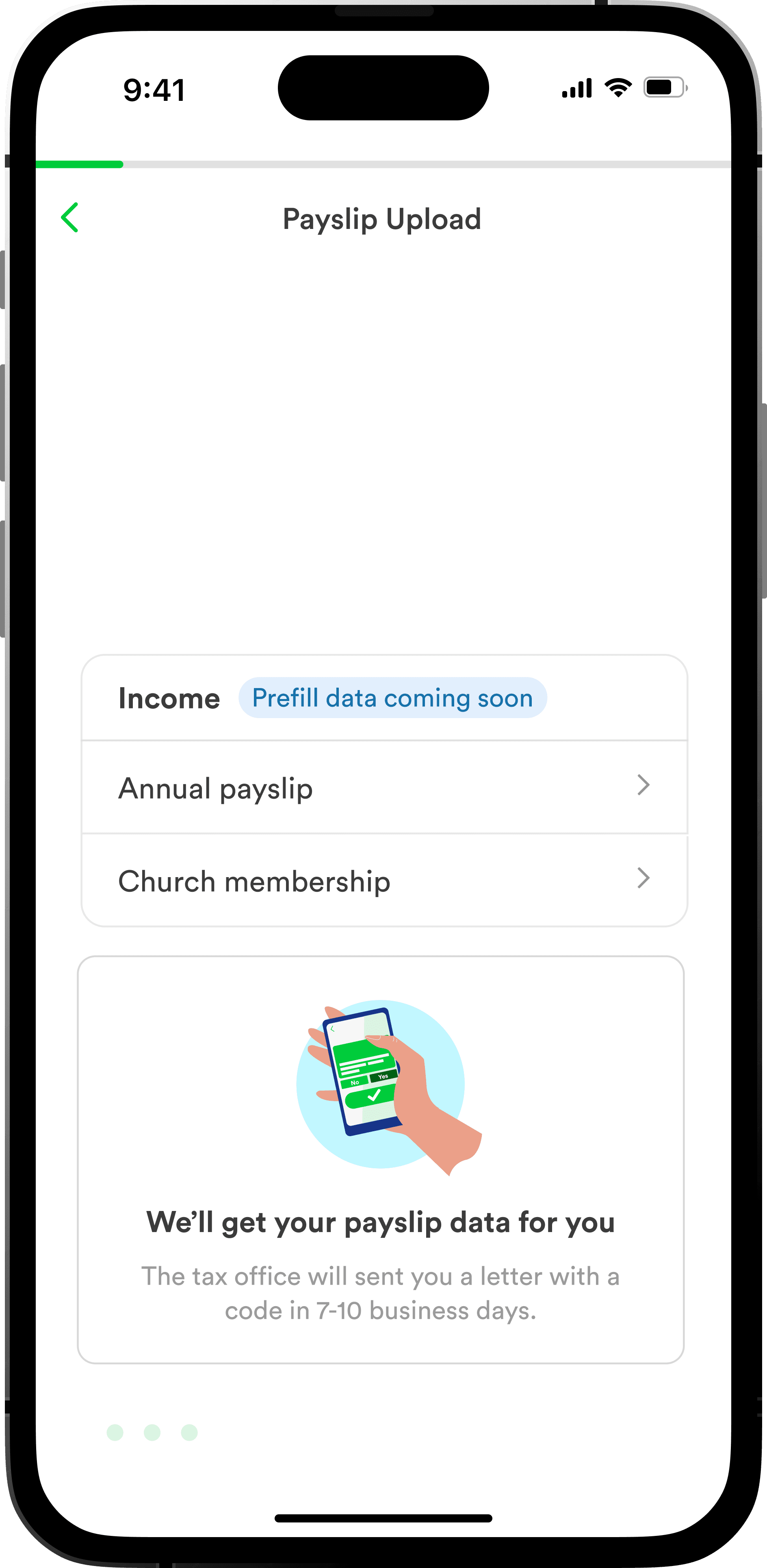
Pre-fill is a system that retrieves tax data the German government holds on behalf of the user — from employers, insurance providers, health funds. The data is valuable. It means users don't have to manually enter most of their tax return. But accessing it required a 3-stage journey that nobody understood.
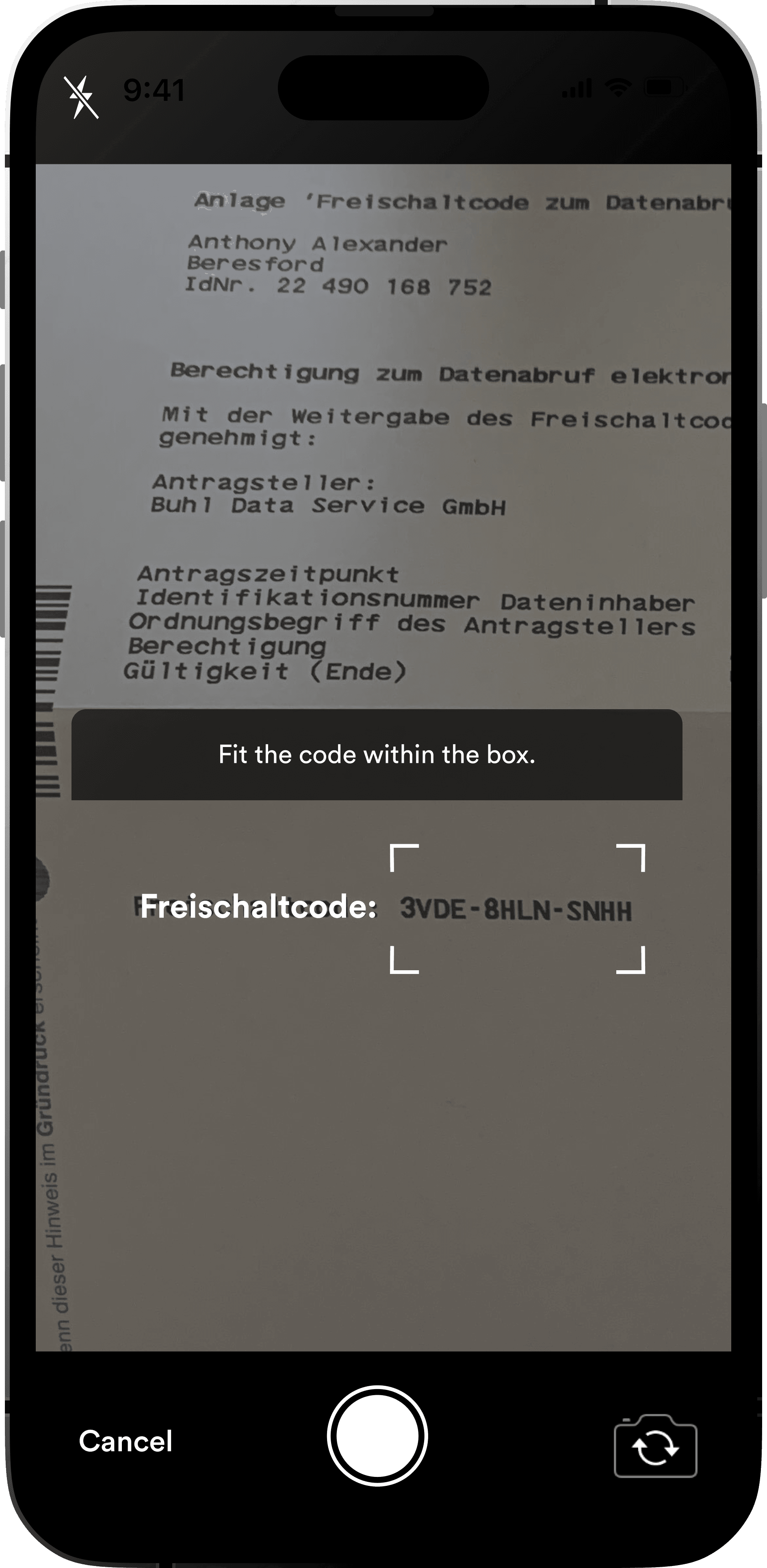
- Opt-in: The user agrees to request their data. We send a request to the tax office. The tax office sends the user a unique activation code via physical post. This takes 7-10 business days, sometimes up to 3 weeks during tax season.
- Code entry: When the letter arrives, the user enters the code into the app for real-time validation.
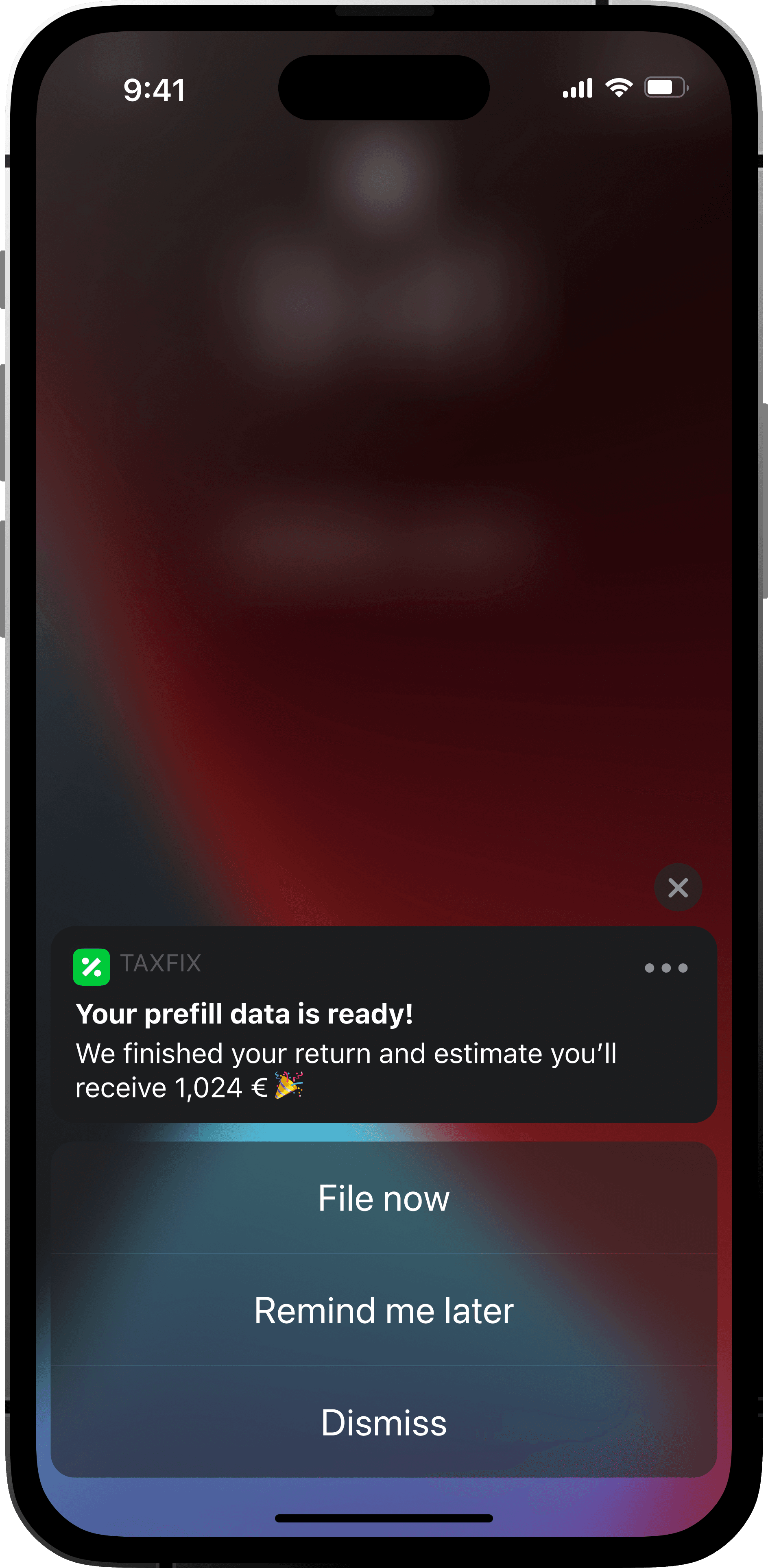
- Data retrieval: After another 48 hours, we receive the user's tax data and they can start their return with fields pre-populated.
This was a 0-to-1 feature. There was no existing opt-in rate to 'improve.' The business target was 20% conversion — getting one in five users to opt into a process that required waiting weeks for a physical letter before they could even start.
Research Without the Language
With one researcher for the whole company and no budget for dedicated German-language user interviews, I needed another way in. I went to Intercom. Hundreds of customer service conversations about the pre-fill flow, all in German. I exported the transcripts, ran them through translation, then printed and clustered them physically — post-it notes on a wall, looking for patterns.
The themes appeared fast. Users weren't unconvinced by the value of pre-fill. They were confused about what happens at each stage. They didn't know why they had to wait. They didn't understand the code when it arrived. They didn't know what the 48-hour processing period meant. The problem wasn't persuasion — it was comprehension.
The problem wasn't persuasion — it was comprehension. Users understood the value. They didn't understand the process.
I synthesised the themes in FigJam and walked the team through them. This was the first time anyone had built a combined view of the pre-fill experience across all stages. Research, customer service data, and stakeholder assumptions had never been brought together before.
The Solution
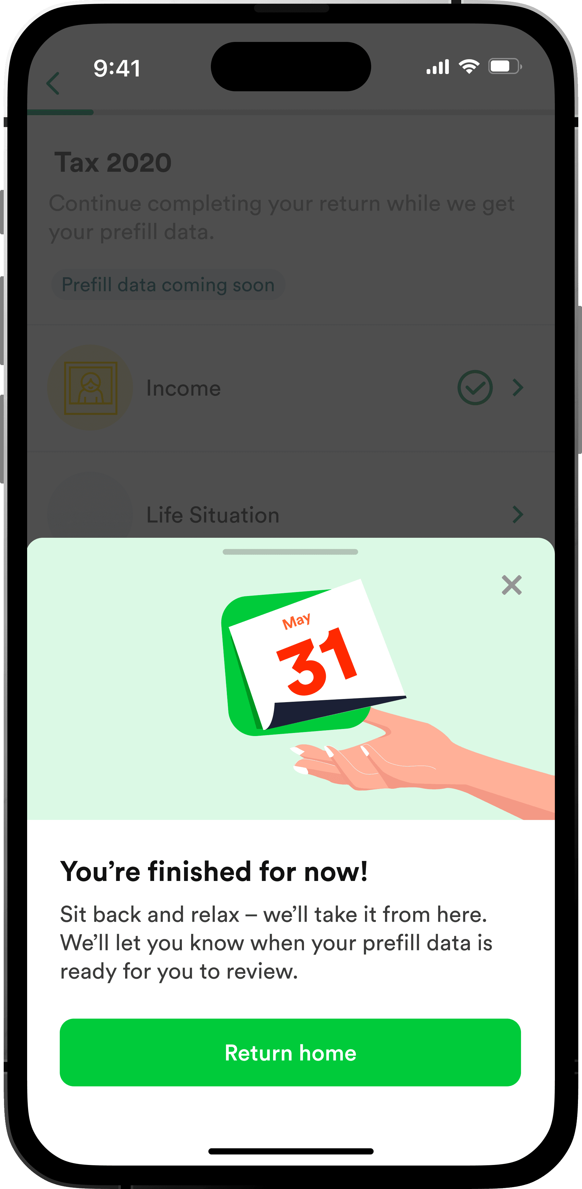
Three design decisions defined the outcome. First, a mini-onboarding that explained the 3-stage journey with clear timeline expectations upfront, rather than just selling the benefits. Users needed to understand what they were committing to before they could trust it. Second, progressive disclosure that only showed information relevant to the user's current stage — reducing confusion by not explaining the code entry process before the letter had even been sent. Third, I shifted all stakeholder reviews from static mockups to interactive prototypes.
The prototype shift was the most impactful change. Stakeholders stopped commenting on button colours and started thinking about the user journey. The quality of feedback improved immediately because people were experiencing the flow, not reviewing screenshots.
The final pre-fill flow guided users through each stage, only showing what was relevant to where they were in the process.
Sketch to Figma in Two Weeks
While owning the pre-fill feature, I also led the migration of the entire design team from Sketch to Figma. The team was around 20 designers. I ran structured training sessions over 2-3 weeks, covering component architecture, auto-layout, and collaborative workflows. The goal wasn't just switching tools — it was establishing shared patterns that would make the team faster.
This was one of the more straightforward wins. Designers were already frustrated with Sketch's collaboration limitations. The training sessions gave people confidence to switch without losing velocity, and the shared component libraries meant less duplication across teams.
Results
The pre-fill feature launched and hit 44% opt-in — more than double the 20% target. Support inquiries related to the pre-fill journey dropped measurably as users stopped asking 'what happens next' at each stage. The design shipped within 3 weeks of active design work once we had alignment.
- 44% opt-in rate on a 0-to-1 feature (target was 20%)
- Measurable reduction in pre-fill-related support inquiries
- Shipped within 3 weeks of active design after stakeholder alignment
- Led Sketch-to-Figma migration for ~20 designers in 2-3 weeks
44% opted in. The target was 20%. But the real win was that support inquiries dropped — users finally understood the process.
What I Got Wrong
I didn't push hard enough for data before committing to a direction. The Intercom research was scrappy and effective, but I should have demanded more structured user research earlier. Instead, I accepted the constraint too quickly and worked around it. The result was good, but I was operating on thinner evidence than I should have been comfortable with.
There were too many executive walkthroughs. Presenting work to leadership is necessary, but the volume of review cycles created distraction. Each walkthrough risked derailing the direction based on opinions rather than data. I should have been more assertive about gating stakeholder input behind user evidence.
Engineering integration was harder than expected. The design shipped fast, but getting it into production took longer because the pre-fill system touched government APIs, security requirements, and legacy code. I didn't account for enough of that complexity in the initial timeline.
I accepted the research constraint too quickly. The outcome was good, but I was operating on thinner evidence than I should have been comfortable with.
Each of these gaps became something I corrected in subsequent roles. At Sesame, I pushed harder for research infrastructure. At Strike, I owned research directly. At Emesent, I built the research into the prototype itself — code prototypes that collect behavioral data, so the evidence accumulates as a byproduct of the design process rather than a separate workstream I have to fight for.