Taxfix: Building a Feature for Users I Couldn't Interview
I joined Taxfix pre-unicorn as a Senior Product Designer, applied from Brisbane, and spent six months working European nights during Covid before relocating to Berlin. The pre-fill feature I owned was net new: there was no existing opt-in rate to improve. The target was 20% conversion. We hit 44%, and support inquiries about the journey fell 32%. The path there meant designing for users whose language I did not speak, extracting research from Intercom transcripts I could not read, covering a month without a product manager, and learning to fight harder for data before committing to a direction.
Brisbane to Berlin
I applied from Brisbane. Covid hit. For six months I worked European nights from Australia, starting at 5pm AEST to overlap with the Berlin team and finishing around 2am. It was unsustainable and it was the only way in. Taxfix was pre-unicorn, growing fast, and the product problems were interesting.
The team was around five product designers, several content designers, and one user researcher shared across the whole company. Research was scarce. I was assigned the pre-fill feature, which sat at the intersection of German tax law, government infrastructure and user trust. The catch: all user research had to be done in German, and I did not speak German.
I started at 5pm Brisbane time to overlap with Berlin, finishing around 2am. For six months, that was the job.
The Problem
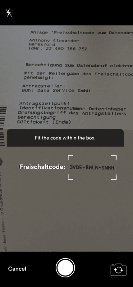
Pre-fill retrieves the tax data the German government holds on behalf of the user, from employers, insurers and health funds. The data is valuable: it means users do not have to enter most of their return by hand. But getting it required a three-stage journey that nobody understood.
- Opt-in: the user agrees to request their data. We send a request to the tax office, which posts the user a unique activation code. That takes 7 to 10 business days, sometimes up to three weeks in tax season.
- Code entry: when the letter arrives, the user enters the code into the app for real-time validation.
- Data retrieval: after another 48 hours we receive the user's tax data and they can start their return with the fields pre-populated.
This was a 0-to-1 feature. There was no existing opt-in rate to improve. The business target was 20%: one in five users opting into a process that meant waiting weeks for a letter before they could start.
Research Without the Language
With one researcher for the company and no budget for German-language interviews, I needed another way in. I went to Intercom. Hundreds of customer service conversations about the pre-fill flow, all in German. I exported the transcripts, ran them through translation, then printed and clustered them on a wall.
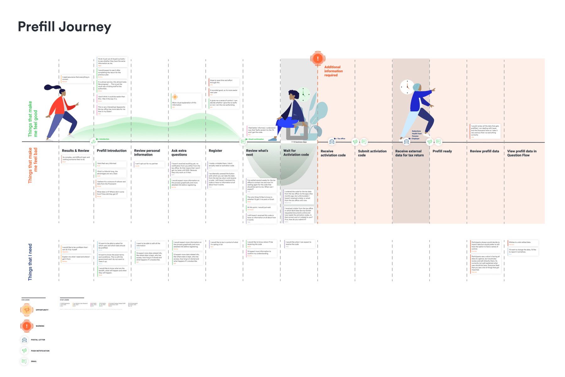
The themes appeared fast. Users were not unconvinced of the value. They were confused about what happened at each stage. They did not know why they had to wait, what the code was when it arrived, or what the 48-hour processing period meant. The problem was comprehension, not persuasion.
The problem was comprehension, not persuasion. Users understood the value. They did not understand the process.
I synthesised the themes in FigJam and walked the team through them. It was the first combined view of the pre-fill experience across all three stages; research, customer service data and stakeholder assumptions had never been put together before.
The Solution
Three decisions defined the outcome. A mini-onboarding that explained the three-stage journey with clear timelines up front, rather than selling the benefits: users needed to understand what they were committing to before they could trust it. Progressive disclosure that only showed what was relevant to the user's current stage, so nobody read about the code before the letter had even been sent. And every stakeholder review moved from static mockups to interactive prototypes.
The prototype shift changed the most. Stakeholders stopped commenting on button colours and started thinking about the journey. The feedback got better immediately because people were experiencing the flow rather than reviewing screenshots.
For about a month there was no product manager on the feature. I covered the gap while staying the designer: scoping the 13 improvements that shipped in three weeks, queuing the five concepts behind them, and working with the engineering manager and the other PMs to get them over the line.
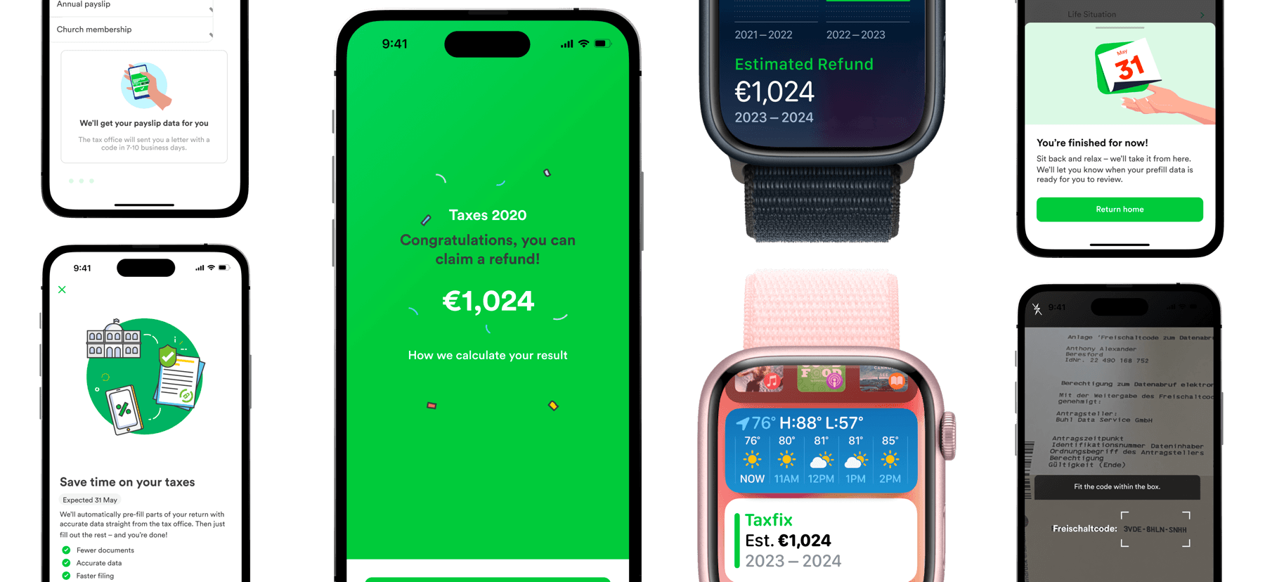
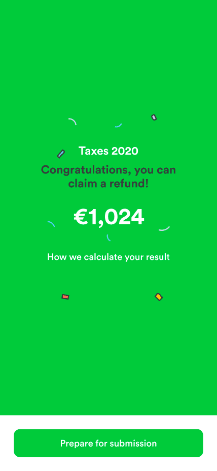
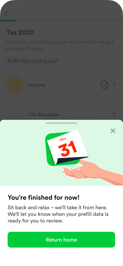
The final flow guided users through each stage, showing only what was relevant to where they were.
Sketch to Figma, team by team
While owning pre-fill I also led the design team's move from Sketch to Figma, around 20 designers. The core migration took two to three weeks; the rollout, team by team, ran four to eight. I ran structured sessions on component architecture, auto-layout and collaborative workflows. The point was shared patterns that would make the team faster, not the tool itself.
Designers were already frustrated with Sketch's collaboration limits. The sessions gave people the confidence to switch without losing pace, and shared component libraries meant less duplication across teams.
Results
The feature launched at 44% opt-in, more than double the 20% target. Support inquiries about the pre-fill journey fell 32% as users stopped asking "what happens next" at each stage. The design shipped within three weeks of active design work once we had alignment.
- 44% opt-in on a 0-to-1 feature, against a 20% target
- Support inquiries about the pre-fill journey down 32%
- 13 improvements shipped in three weeks, with five concepts queued, while covering the PM gap
- Led the Sketch-to-Figma migration for about 20 designers: two to three weeks for the core, four to eight team by team
44% opted in. The target was 20%. The real win was that support inquiries fell 32%: users finally understood the process.
Trade-offs
What I chose, what it gave up, and what I would revisit.
- Chose translated Intercom transcripts over waiting for German-language interviews. Gave up depth, and worked on thinner evidence than I was comfortable with. Would revisit: push for the research budget earlier and gate executive input behind it.
- Chose a mini-onboarding that explains the three stages before asking for the opt-in. Gave up a shorter first screen. Would revisit: no. Comprehension was the problem, and 44% against 20% says the reading was worth it.
- Chose interactive prototypes for every stakeholder review. Gave up the speed of static mockups. Would revisit: no. The button-colour conversations stopped.
- Chose to cover the PM gap myself. Gave up design time on the feature for about a month. Would revisit by asking for the cover to be named earlier.
What I Got Wrong
I did not push hard enough for data before committing to a direction. The Intercom research was scrappy and effective, but I should have demanded structured research earlier. I accepted the constraint too quickly and worked around it. The result was good, and I was operating on thinner evidence than I should have been.
There were too many executive walkthroughs. Presenting work to leadership is necessary; the volume of review cycles was a distraction, and each one risked moving the direction on opinion rather than data. I should have been more assertive about gating stakeholder input behind user evidence.
Engineering integration was harder than expected. The design shipped fast; getting it into production took longer because pre-fill touched government APIs, security requirements and legacy code, and I had not allowed for enough of that in the timeline.
I accepted the research constraint too quickly. The outcome was good, and I was operating on thinner evidence than I should have been comfortable with.
Each of these became something I corrected in later roles. At Sesame I pushed harder for research infrastructure. At Strike I owned research directly. At Emesent I built the research into the prototype itself: coded prototypes that collect behavioural data, so the evidence accumulates as a by-product of the design work rather than a separate workstream I have to fight for.
---