Crates: A Folder Icon System, and the Tool That Applies It
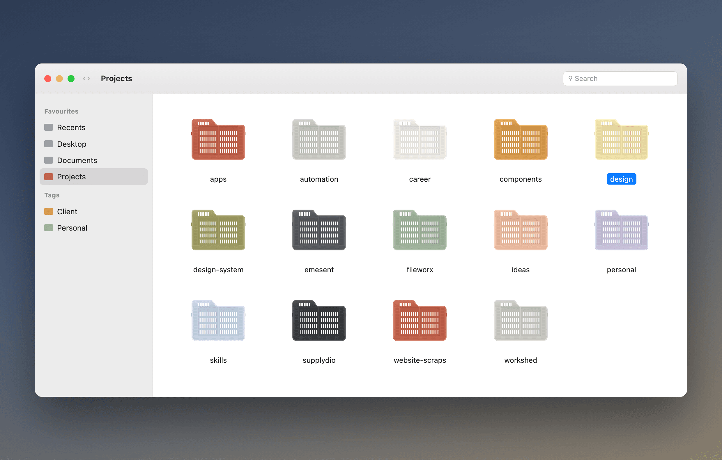
I saw a folding produce crate drawn in the silhouette of a macOS folder and wanted it on my own machine. What I actually wanted was every colour of it, on a hundred folders, without the result looking like confetti. So the piece is really two things: an icon that is generated rather than drawn, and a tool that decides which folder gets which colour.
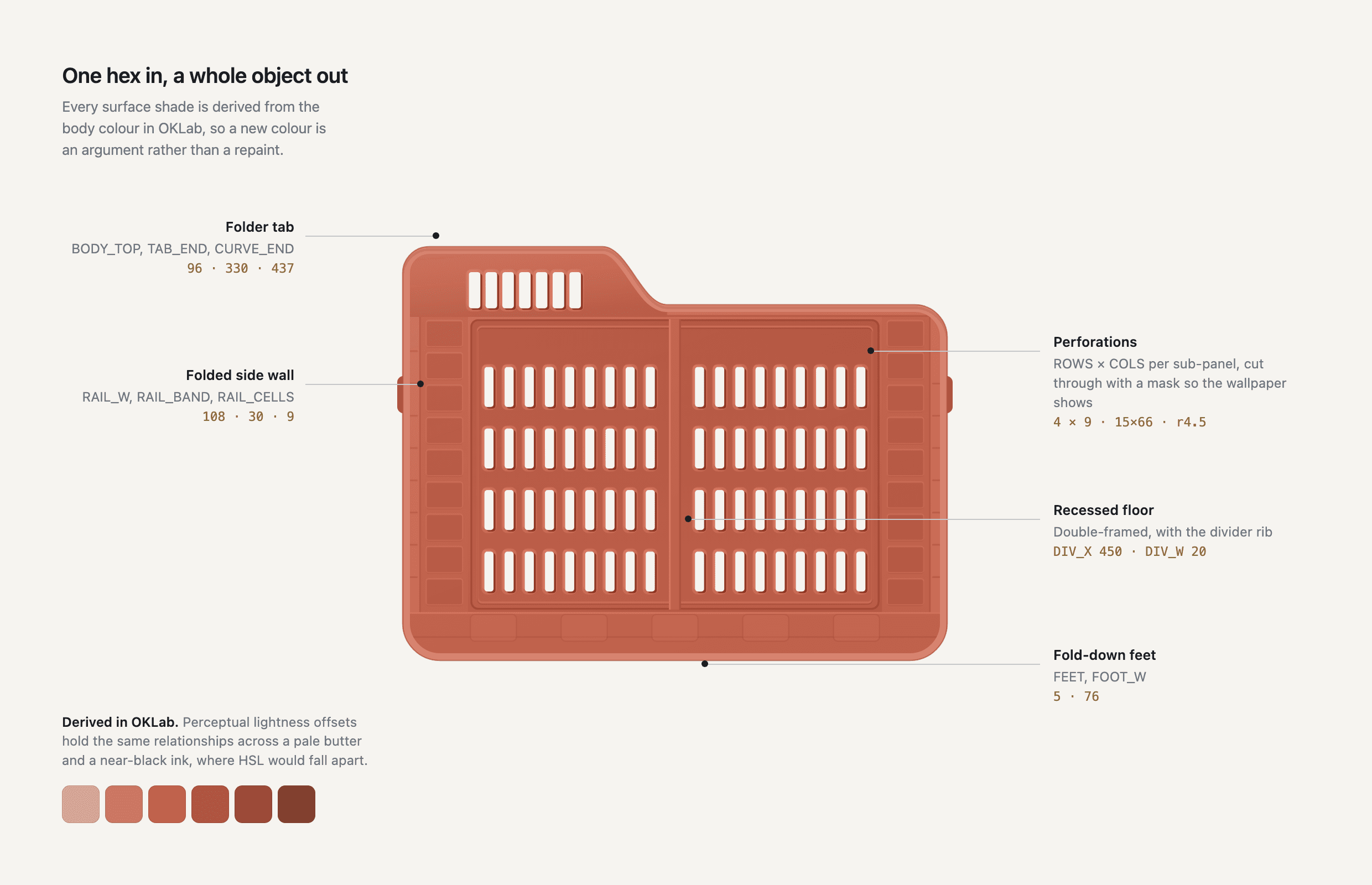
One hex in, a whole object out
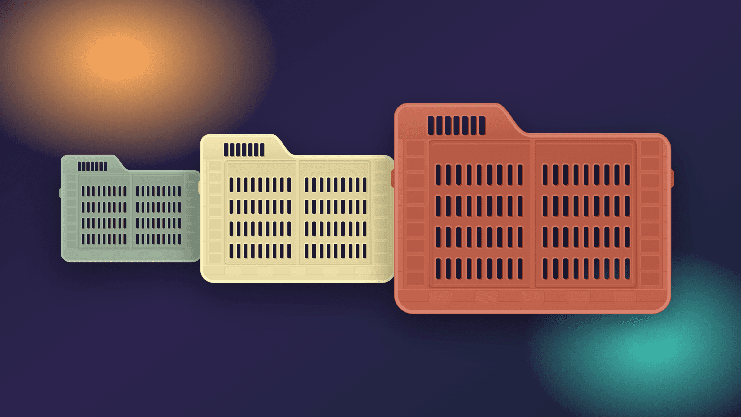
The crate is not a drawing I recoloured twelve times. It is a generator: you give it a body colour and it derives every surface from that one value — the lit top flange, the rim highlight, the recessed side walls, the shadow inside each perforation.
The derivation happens in OKLab rather than HSL, and that choice is doing real work. Perceptual lightness offsets hold the same relationships across a pale butter and a near-black ink. In HSL the same offsets would blow out at one end and collapse at the other. A new colour is an argument, not a repaint.
The part that is actually hard
Drawing one good icon is an afternoon. Putting it on a hundred folders without the result looking like confetti is the design problem.
My first pass assigned a random colour per folder. It looked like a mistake — near-identical colours kept landing next to each other, and colour meant nothing, so it was noise with extra steps. What works is dealing a shuffled palette so every colour is used before any repeats, and placing the repeats far apart in the order Finder sorts them.
Better still, where the folder tree already means something, is inheritance: every project takes its category's colour. Colour stops being decoration and starts answering a question — which area is this.
Random is not the same as varied. Dealing a shuffled deck is varied; picking at random each time just clusters. — What the first version got wrong
Craft decisions a viewer would otherwise miss
The perforations are cut through the artwork with a mask rather than filled with black. The black in the photograph I worked from was the backdrop, not the object — so on a real desktop, the wallpaper shows through every hole.
The icon is also drawn twice. The full artwork has seventy-two perforations, and below about 48px they stop being detail and become grey haze. So there is a second, simplified drawing — fifteen larger slots, a fatter rim, no mouldings — used for the 16 and 32px slots of the iconset. Apple does the same in its own icons. It is the difference between a recognisable folder and a smudge in a sidebar.
Making it fold
Crate is closed · click to fold
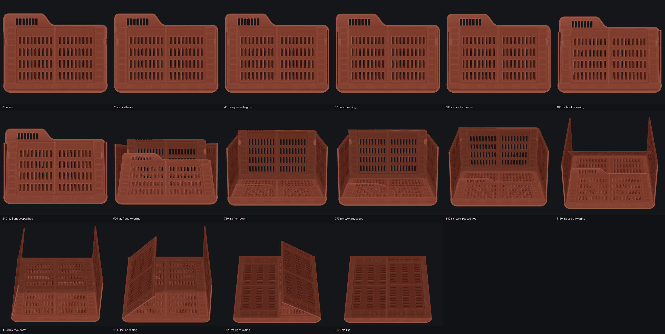
The one thing a still image cannot tell you about this object is that it folds. So the icon is the front of a crate, and clicking it folds the crate flat the way the real one folds: front, back, left side, right side.
Hover is deliberately almost nothing, a four pixel lift over 140ms. It is seen constantly, so it says 'this responds' and gets out of the way. The click is where the budget goes, because it is rare and it explains something.
The first version squashed the icon vertically. It looked like folding and explained nothing, because that is not how the object works. The version that shipped came from studying the real mechanism and then holding the animation to it: walls with thickness, hinges with somewhere to sit, latches that release before anything moves, and no part allowed to pass through another.
The hardest constraint was that the resting frame had to stay the icon. A real crate is wider than its front wall, so for a long time the base was hidden and faded in. That fade was the last thing to go. The fix was to read the icon differently: its bottom band is the base, and the strip at each edge is a side wall seen end on. Once the icon was the elevation of the object rather than a picture stuck to the front of it, nothing needed hiding.
Shipped
It is open source, MIT, with no install dependencies — it uses tools that already ship with macOS. Styles are pluggable, so the crate is the bundled one rather than the only one.
- Apply to a folder, a Finder alias, or the boot volume
- Sweep a tree under an inherit or shuffle scheme, with a dry run first
- Twelve bundled colours, or any hex
- Handles the three things that bite: the Icon file dirtying git repos, iCloud-synced directories, and Finder's icon cache
github.com/cameronhenkes/crates