Currently in
Currently in

Reimagining how people discover and book healthcare to improve accessibility
When I joined Sesame in 2021, I worked as a senior product designer on a remote team spanning Berlin and New York. The company was tackling a massive problem in American healthcare: making quality care accessible to millions who couldn't afford it due to high costs and confusing pricing.
An important challenge I worked on was reimagining how people discover and book healthcare. The existing experience was fundamentally broken - patients would search for symptoms but our platform was organised by provider types, creating a disconnect that led to abandoned searches and delayed care.
Reimagine how people discover and book healthcare by addressing search misalignment, decision paralysis, mobile experience gaps, and trust barriers.
Conducted 50+ unmoderated testing sessions across different demographics and analyzed search patterns to create symptom-based entry points.
Senior Product Designer working remotely with teams in Berlin and New York to make quality healthcare more accessible.
When I joined Sesame in 2021, the mobile experience was particularly poor, with conversion rates significantly lower than desktop despite mobile being the primary way people search for immediate healthcare needs. Users were searching for symptoms but our platform was organized by provider types, creating a disconnect that led to abandoned searches and delayed care.
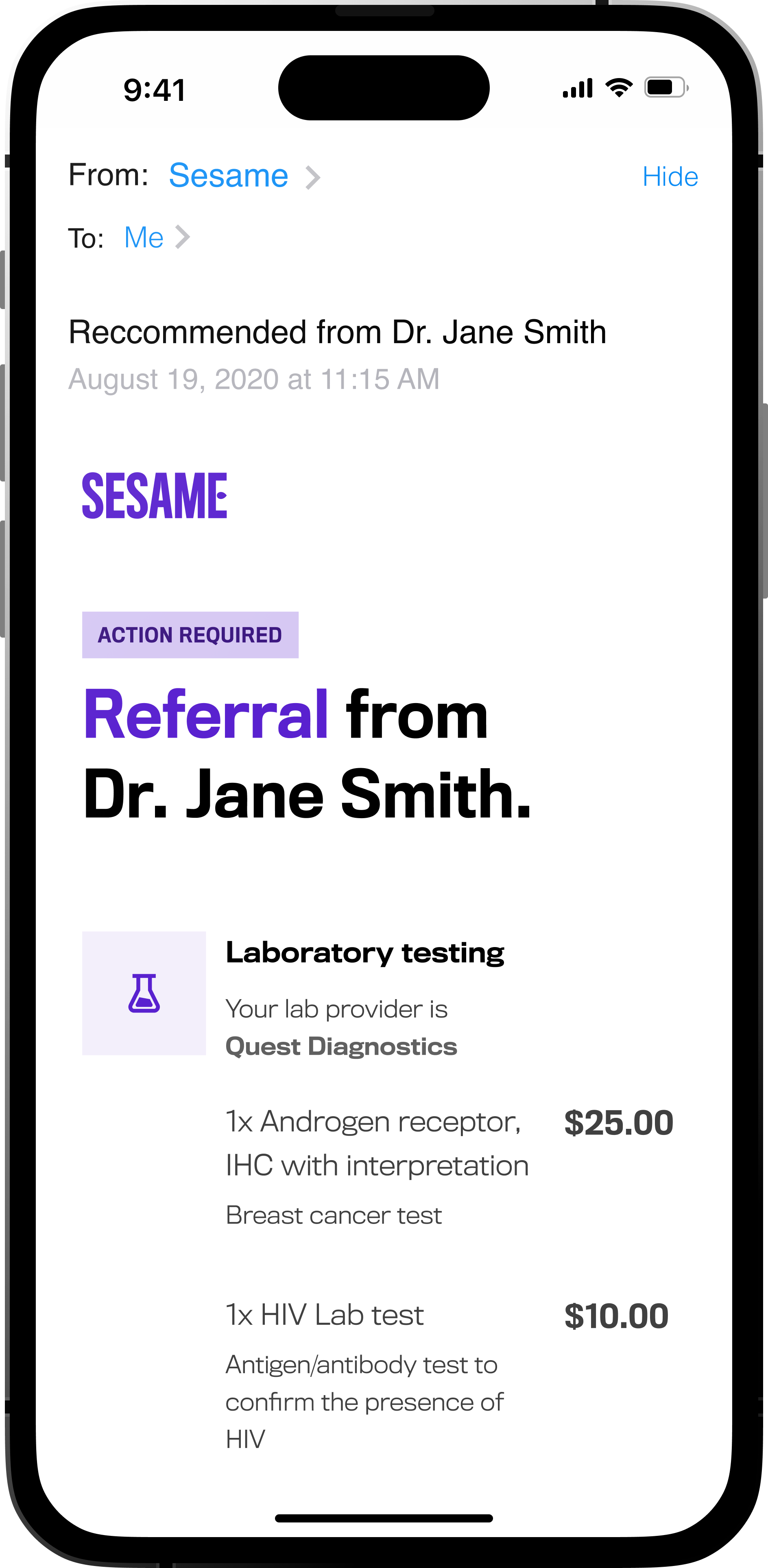
We redesigned the entire mobile experience around how patients actually think about their healthcare needs. The screens below show the complete user journey from symptom search to provider selection and booking.

Redesigned search experience that starts with symptoms instead of provider types.

Streamlined provider selection with clear price and availability indicators.

Reduced friction in the booking flow to improve mobile conversion rates.

Enhanced provider profiles with clear pricing, availability, and credentials in a scannable format.
Healthcare design requires a different approach than typical e-commerce. People aren't just buying a service - they're making decisions about their wellbeing often when they're vulnerable or in pain. Every design decision had to balance efficiency with empathy.
On mobile, this meant creating clear information hierarchy that prioritized the most important decision factors: price, availability, and relevant credentials. We also developed a mobile-specific appointment tracking system that kept users informed at every step.
Healthcare in the US is notoriously difficult to navigate. The specific challenges we faced were:
Before: The original experience started with provider categories and forced users to filter by specialty, location, and availability separately.
After: After understanding how people actually searched for care, we created symptom-based entry points that guided users to appropriate providers while maintaining transparency about pricing and quality indicators.
When you're working on products that affect people's wellbeing, leading indicators of success often matter more than lagging metrics. Focus on measuring the right thing, not just the easiest thing to measure.
— Key Learning
I spent weeks analyzing search queries to understand how people actually described their healthcare needs. The patterns were clear:
While conversion improvements were important, the real measure of success was whether we were genuinely expanding healthcare access.
Our post-appointment surveys revealed that nearly a quarter of users who booked through our platform had previously delayed seeking care due to cost concerns. That metric meant more to our team than any conversion rate.
Healthcare design requires a different approach than typical e-commerce. People aren't just buying a service - they're making decisions about their wellbeing often when they're vulnerable or in pain.
Every design decision had to balance efficiency with empathy. We couldn't just optimise for conversion; we had to ensure people felt confident about their choices.
When I started, we had lots of data but it was fragmented across different tools and teams. Support knew why people called with questions, marketing knew where traffic came from, but no one had a complete picture of why people weren't converting.
So I mapped the entire journey from symptom awareness through post-appointment follow-up, identifying every point where users dropped off or expressed confusion.
We ran continuous testing throughout development. I set up unmoderated tests that let us observe natural search behaviour without the bias of talking to a researcher.
The insights were immediately actionable:
People in healthcare situations want clarity and confidence, not choices. The best interface removes decision-making burden while maintaining transparency.
When you're working on products that affect people's wellbeing, leading indicators of success often matter more than lagging metrics. Focus on measuring the right thing, not just the easiest thing to measure.
This project taught me that great healthcare design isn't about making things look medical - it's about reducing anxiety and building confidence in people's healthcare decisions. The most important improvements often happen in the details: clearer language, better information hierarchy, and removing unnecessary steps between someone recognising they need care and actually getting it.