Currently in

Australia
Cameron Henkes
Cameron Henkes
Currently Available
Taxfix: Redesigning Complex Tax Processes While Working Remotely Across Cultures

Taxfix: Redesigning Complex Tax Processes While Working Remotely Across Cultures

Cross-Cultural Product Design for 300,000 Users

Summary

  1. Working remotely from Australia, I redesigned a complex German tax process where users waited up to 3 weeks for physical letters, creating a mini-onboarding that achieved a 44% opt-in rate for 300,000 users.
  2. I developed a language-aware layout system accommodating German text (typically 20-30% longer than English) while maintaining visual hierarchy across all screens and interaction points.
  3. Synthesising fragmented insights across marketing, support, product, and research teams, I created a cohesive journey map exposing confusion points that previous analyses had missed.
  4. Shifting from static design presentations to interactive prototypes transformed stakeholder feedback, focusing discussions on user experience rather than visual details and building empathy for complex user journeys.
  5. My risk-based prioritization framework ("Drop Everything," "Prioritize for Next Sprint," or "Next Available") helped us make difficult trade-offs while keeping stakeholders aligned across time zones.
  6. I led the transition from Sketch to Figma and drove the creation of a comprehensive design system that reduced development time by 40% while ensuring consistent experiences. This system became the foundation for all product development, improving handoff efficiency and scaling our design capabilities across the growing team.

Project Summary

Challenge

Reimagining a complex, multi-stage government process for 300,000 users while working remotely across cultures and time zones.

Approach

I took on the prefill feature as my first major project, approaching it methodically: 1) Comprehensive Problem Mapping: I synthesized all user research into a single journey map, exposing confusion points missed by previous analysis. 2) Cross-Cultural Design Strategy: Developed a language-aware layout system, mini-onboarding, and progressive disclosure patterns. 3) Evidence-Based Decision Making: Shifted to interactive prototypes, categorized feedback by risk, and aligned stakeholders across time zones.

My Role

Senior Product Designer

Results

  • 44% opt-in rate in first release
  • 32% reduction in support inquiries
  • 13 key improvements delivered in 3 weeks

The Challenge

When I joined Taxfix in 2020, I did so remotely from Australia until COVID would allow me to relocate to Berlin.

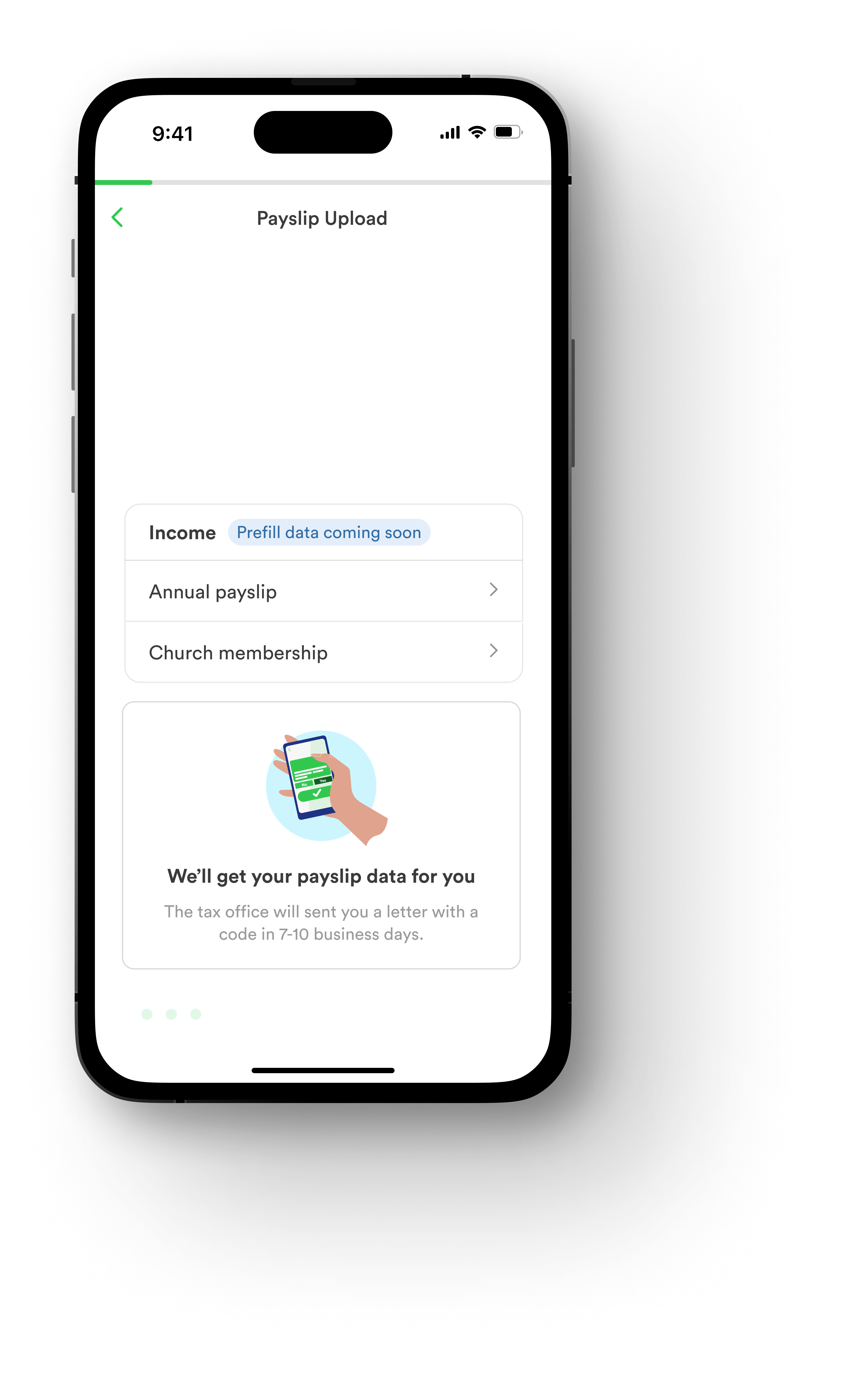
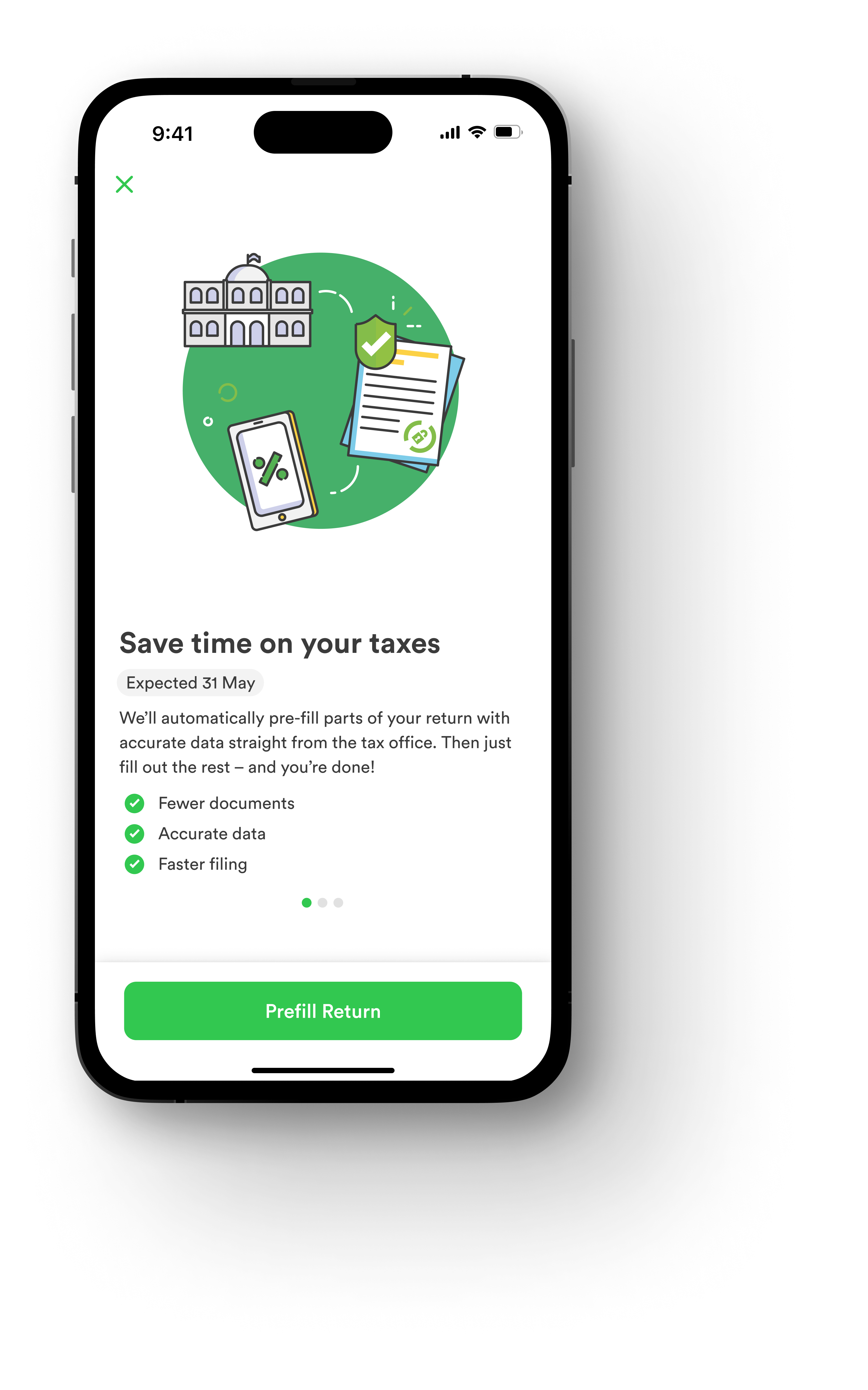
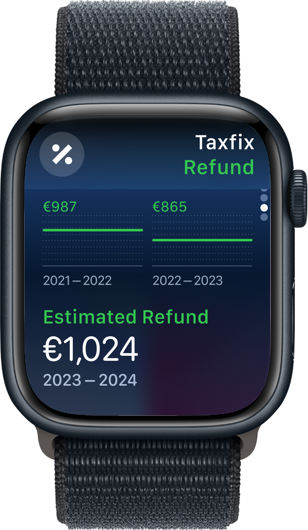
An important project I took over was prefilling tax returns. Prefill is data held by the tax office that is reported by third parties. In Germany, this information comes from employers, insurance providers, health funds, and various others. This information is incredibly valuable as it not only reduces the amount of time users spend preparing their return but also does it in an accurate way. It was a great tool for building good retention and conversion rates.

Accessing government services in Germany is often over-complicated for no reason. The challenge we had to deal with was the retrieval of the data which had to be done in 3 unique journey stages:

Opt-in – When the user opts in, we would send a request to the tax office. The tax office would send the user a unique code via post. Typically, this would take 7-10 business days, but when tax season is open, this can take up to 3 weeks.

Entering the code – When the user receives their code, they enter it into the app which is validated in almost real-time.

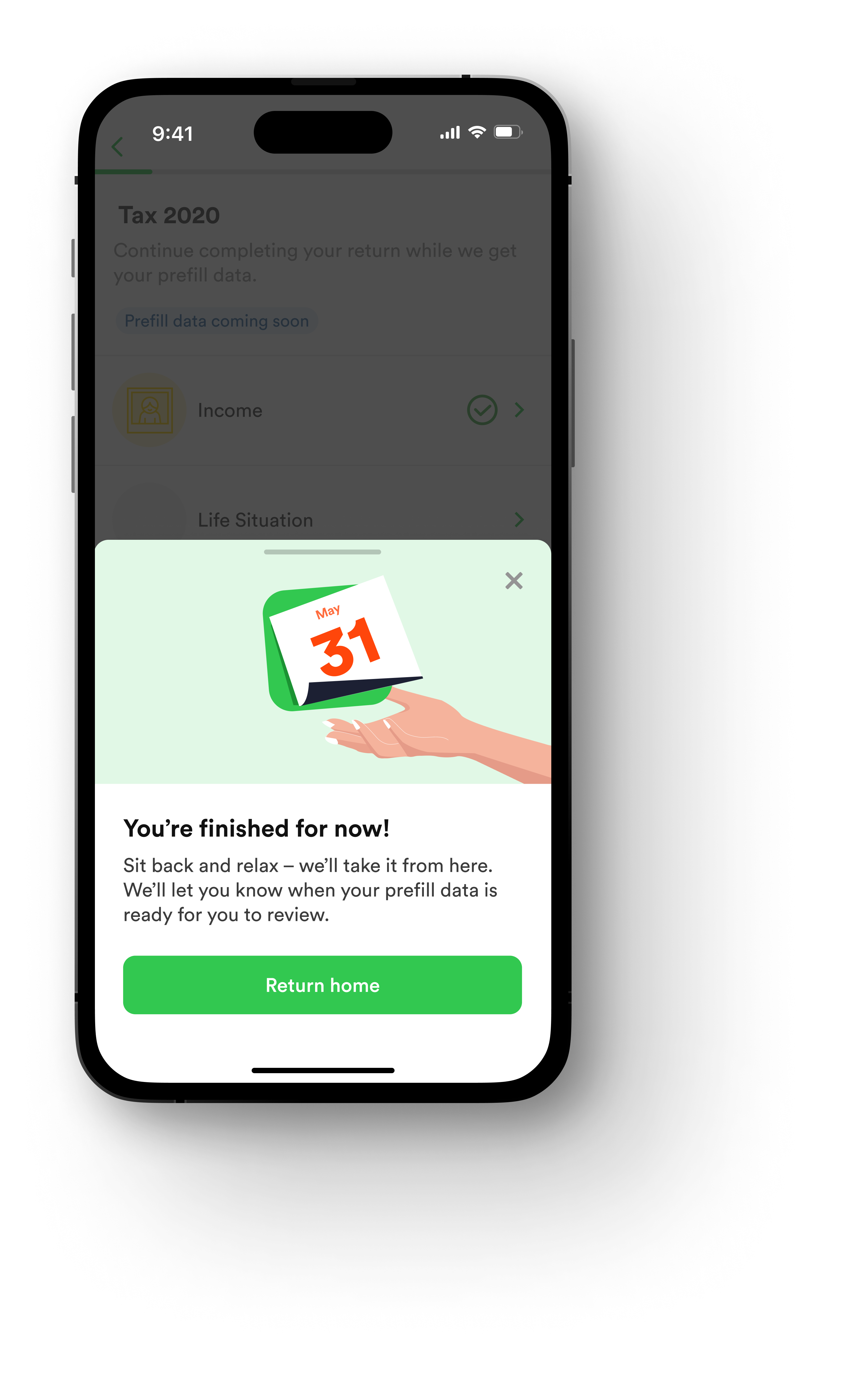
Preparing their return - After 48 hours, we typically receive the user's data after which they can start their return with prefill data.

The Solution

We allowed users to opt into the prefill feature first to understand whether this was a viable product direction. Following user feedback closely and customer service conversations, we evolved the experience design.

After 3 weeks of iterating, testing, and reviewing, we finally arrived at a solution. While we could've taken additional time and resources to validate a more comprehensive list of hypotheses, we wanted to learn by getting something there as soon as possible and talking to users who were using the feature to iterate it best.

Before and After Before The original focus in the first iteration was communicating the key benefits of prefill and encouraging users to opt-in.

After After hearing from users who experienced the full journey of prefill, we discovered that users were more confused about what happens in each stage.

To overcome this, I chose to add a mini-onboarding style journey so users could better understand what the experience would entail.

Before and After Comparison

User Onboarding
After

After hearing from users who experienced the full journey of prefill, we discovered that users were more confused on what happens in each stage.

Data Collection
After

After hearing from users who experienced the full journey of prefill, we discovered that users were more confused on what happens in each stage.

Document Upload
After

After hearing from users who experienced the full journey of prefill, we discovered that users were more confused on what happens in each stage.

Final Review
After

After hearing from users who experienced the full journey of prefill, we discovered that users were more confused on what happens in each stage.

What We Delivered

What we delivered within a quarter were huge improvements to the user experience. Delivering most within 3 weeks:

Achieved an opt-in rate of 44% in first release 13 key product improvements 5 feature-ready concepts for next quarter Improved user experience across the entire flow Designing for English & German Designing for an English and a German version can be a challenge as German copy is always a lot longer than the English version. For example, in English what we described as "Prefill" was "Datenabruf." This had to be kept in mind when designing.

Key Screens

Initial State
Original tax return interface before redesign
Screen Flow A
Initial user onboarding and setup process
Screen Flow B
Data collection and verification flow
Screen Flow C
Document upload and processing interface

The Process

When I first started on the project, we had an enormous amount of user research and customer service data, but nothing offering a combined view of the journey. We had no joint understanding across our stakeholders of how users felt and where our pain points were. We were only guessing. So that's what I did - I combined all the research together to form a picture of our current experience and planned our future activities from there.

Ideating on Improvements to Pain Points As the team was situated across the globe, I held ideation sessions with a wide range of stakeholders (developers, content designers, and tax experts) to best explore how we could integrate pre-fill into our product whilst providing the best user experience.

Before I onboarded to the project, communication had been a key issue in preventing project success. To overcome the existing hurdles, I used the following techniques within these sessions:

Affinity clustering: clearly identified the core problems in the user's prefill journey Crazy 8s: exposed gaps in the group's perception of the journey Dot voting: created a consensus on our approach, and when paired with a why, ultimately created a common understanding of the end-solution All of these techniques (combined with some others) was a super effective method of getting everyone on the same page and pushing the project into a more mature state.

Comprehensive User Journey Mapping

When I first started on the project, we had an enormous amount of user research and customer service data, but nothing offering a combined view of the journey. I combined all the research together to form a picture of our current experience and planned our future activities from there.

Journey Map

Comprehensive user journey mapping

Interactive Prototype

Interactive Prototype
Interactive prototype demonstrating key user flows

Iterate, Present, Review, Iterate

There were so many chefs in the kitchen. From C-level, heads of departments through to developers and other peer designers.

After some iterating on how concepts were presented, I delivered all concepts in a prototype and moved away from showcasing static designs. This really helped our stakeholders think about the user, to build on the empathy.

Presenting back user insights during the prototype helped our stakeholders give more quality feedback to real user problems.

Learning #1 Presenting in a prototype will not only help stakeholders think more about the journey the user will have to go through, but it also helps you gather more quality feedback as your stakeholders think more about the user journey.

Final Results

Screen Flow D
Final review and submission process
Screen Flow E
Confirmation and status tracking
Screen Flow F
Success state and next steps

Dealing with Unexpected Issues

From limited user research resources (I don't speak German and it had to be done in German) to unknown complexities with the German Tax Office, I approached each issue according to a risk score: Drop Everything, Prioritise for next Sprint, Next available.

This would help us make sure we dedicated resources to the areas that needed it.

Learning #2 When you're limited to doing research, reach out to customer service and gather conversation data. Put them on post-it notes and start clustering them together. You'll start seeing trends quickly and cheaply.

Watch Concept 1
Smart watch integration for quick updates
Watch Concept 2
Extended watch functionality and notifications